
Adding power words to your B2B SaaS website headlines won't fix conversions. Do this instead.
Change your mindset. Go after bigger opportunities. Fix these 3 website areas that startups almost always neglect.
If there’s one thing that I hate with the fire of a thousand suns it’s the assumption that tweaking a word in your headline, or, y’know, adding “NOW” to your CTA is going to magically transform your website’s performance and make everything 200x times better.
If only it was this simple.
The reason I’m so deeply annoyed with “Just add some POWER WERDS” tips is that they pull readers’ focus away from a bigger question: out of all the reasons that the copy is not converting, is tweaking your hero section headline likely to give you the biggest lift… or is it a distraction from finding bigger, better opportunities?
Messaging that just doesn’t resonate with you ICPs — headline tweaks won’t fix that.
Positioning that doesn’t make sense to your ICPs because they perceive the industry differently (and don’t buy into your vision) — headline tweaks won’t fix that either.
Same goes for page layouts that are confusing, hero sections that are so vague they could be on any other website (including in a totally different vertical), or a demo signup experience that involves 10+ fields in a signup form in exchange for a promise that someone will be in touch.
I’ve reviewed dozens of early-stage startup websites and worked with Series A and bootstrapped companies on their web copy and messaging, and in all cases, tweaking hero section headline was not the answer.
The answer was figuring out why the website was actually underperforming — and how to fix that.
The “how” will depend on your product and your audience. But the website sections that are neglected are almost always the same.
High bounce rates, low conversions? Start here.
Mindset: from startup-focused to customer-centered
Markus Rentsch uses “self-centric” in one of his posts — that’s an even better term; what it comes down to is focusing on customers vs focusing on internal metrics or processes).
Who is the website for? How do you measure its performance? What are the metrics that really matter? MQLs? Demo signups? Closed deals? For many startups, the main focus is on generating demo signups that go directly to your sales team.
In some (actually, way too many) cases, this means that the website is designed for the sales team as the primary customer, creating friction where there shouldn’t be any:
long, longer, the longest forms
no information on what to expect
no timeline for a response from the sales team
confusing sign-up flows
no message-matching between signup steps
Not a hot take, more like common sense: the goal of the website should be making it easy for specific customer segments to make an educated decision about the product, as opposed to making it easy for the sales team to evaluate leads.
Same goes for other internal-KPI-driven decisions that get in the way of long-term conversions:
If you’re focused on driving organic traffic to your website, should you be focusing on high-volume keywords, or keywords relevant to buyer journey and questions your prospects are asking?
If you’re focused on MQLs, should you focus on gating everything to capture those leads, or should you be making it easy for your prospects to educate themselves and reach out when they’re ready (it’s still your job to encourage them to do so)?
Switching to customer-centric mode means finding ways to align website structure, page outlines, and page content with the way ideal customers want to research possible solutions, consume content, and interact with your startup. This includes the way copy, blog content, and buyer enablement collateral work together (anything from the way you display case studies to gating or ungating lead magnets).
On a page-elements small scale, it also means figuring out how to present your features.
Outside of “It has pockets”, and especially if you’re in SaaS where your competitors have similar features, “What can it do?” is less important than “What can I do with it?”
The tricky part in this case is knowing what those use cases and corresponding benefits are — as opposed to guesstimating based on internal conversations. This doesn’t mean that features should not be named — or that they should not be mentioned. Rather, it means checking that your features description sections are answering the “What’s in it for me?” question — and not in a generic way.
This is where most of the opportunities are: going beyond “What our competitors are up to” or “This is what everyone does,” and focusing on your prospects. And, those opportunities are endless: buyer enablement collateral, onboarding sequences, in-depth “How they did it” content, templates, nurturing sequences, upsell sequences…
…basically, anything that helps your prospects achieve their goals — with the help of your product.
Evaluate your website for customer-centricity
- Page level: How customer-centric is your copy? How connected is your on-page copy to the things your prospects care about (pain points, desirable outcomes, and corresponding emotions)?
- Website structure level: Are website visitors interacting with it the way you expected them to? Or does it look like something's missing?
- Website level: Is there a good reason for each form field and for each form? How high are form drop-offs and squeeze page bounce rates?
- Website level: Are your gated content, blog posts, and any other type of buyer enablement content aligned with team goals, or customer goals?
Optimize your website for customer-centricity
- Page level: How can you move your copy overall further away from startup-centric to customer-centric?
- Website structure level: What are the opportunities to make landing pages and exit pages more customer-centric? How will you know you've achieved that goal?
- Website level - forms: For each form, how can you reduce friction (by removing the form, reducing the number of fields, or optimizing the signup experience)?
- Website level - conversion funnels: Is there a mismatch between expected results and actual results? What does it tell you about your prospects? How can you make your funnels more customer-centric?
Customer-centricity: inspiration station
Baseten and a non-overwhelming way to keep visitors scrolling
“Everything is connected” is true for websites as well. And in this case, Baseten makes it easy to follow the red thread and keep finding out more about the product.
Examples:
Demo video focused on showcasing the product
A high-level overview of features
Customer stories with use case descriptions
Examples of what’s possible in the project gallery
An opportunity to play with live demos
Corsha: Answering the “How relevant is this product for my company?” with an ungated (!!!) B2B quiz
Gating quiz results only works if your prospects are invested in getting that result so much that they are willing to give you their email address. For B2B, this is not always the case (especially if your sector is notorious for endless sales follow-ups).
Instead of trying to lead-magnet your way into prospects inbox, what if you used this as an opportunity to both educate your prospects and help them self-diagnose the urgency of the problem you can solve for them?
This is exactly what Corsha does.
Doppler: stopping the (case study) scroll
Exciting headlines. Visuals that provide context. A case study that has jokes in it.
It sounds like it’s not a lot, but when many startups rely on cookie-cutter headlines and fluffy placeholder copy, breaking the mold stops the scroll and brings readers joy.
The section that makes my heart sign, though, is the “Who would you recommend our product to?” breakout at the bottom of the study.
Stonly: use case page to challenge preconceived notions
So you think you need those NPS scores? Stonly shows why you don’t.
When your prospects don’t believe that this is a problem that they need solving or that your solution category is right for them, glossing over that objection will cost you leads — they won’t have a reason to change their mind. Instead, challenge their beliefs, make your case, include social proof, showcase your product.
Hero section: from placeholder copy to ideal-prospect magnet
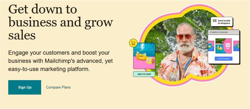
I have a theory that the biggest challenge for B2B SaaS startups working on their hero section headlines is not finding the value prop — it’s finding the best way to express it without getting distracted by competitors, especially of the category-leader kind that can get away with high-level, generic headlines.
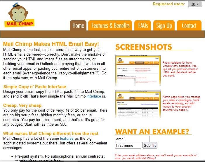
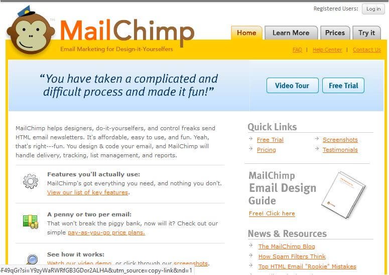
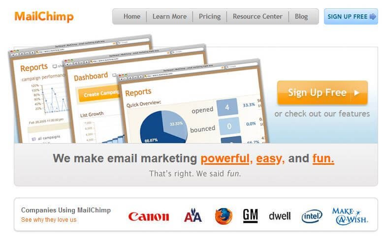
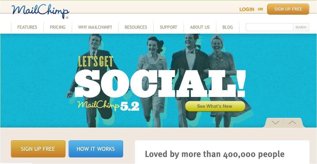
Everyone already knows what MailChimp does (right?), so the headline doesn’t need to pass “But what does it do?” test. Any new visitor arriving on the website likely already knows what MailChimp does, what their product does, and who it’s meant for. (But if you look at earlier website versions - thank you, Wayback Machine - you’ll notice that the headline used to be much more specific.)
Not the same for startups.


Hero section: start with answering these key questions
Startup website visitors are likely to have less background information about the company and to be more skeptical.
Whether it’s paid traffic to a landing page, cold outreach prospects checking out your website, or organic visitors coming to your homepage from your blog, they need more context. Which means that hero sections for startup pages need to do better than a vague benefits-oriented statement that doesn’t answer any of these questions:
Who this product is for?
Why should the target audience care?
How is the product different?
If the hero section is confusing, you’ll lose your visitors because they won’t care enough to investigate further.
If the hero section is generic, you’ll either lose your visitors because they don’t see the point of scrolling down, or attract bad-fit prospects who misinterpreted your value proposition (carefully constructed during a brainstorming session).
It is important to know what competitors’ messaging and positioning are, and it is, of course, important to have a value proposition (and brand messaging).
But the place to look for resonating messages is not on competitors’ websites, and not in brainstorming sessions.
Instead, it means looking to prospects and customers for answers on what matters to them the most. It doesn’t necessarily mean “Talk to your customers!” (a problem for early-stage startups), but it means focusing on phrasing and messages that matter to your target audience. Here are some options for finding positioning angles, messaging approaches, and memorable copy that’ll resonate with your prospects:
Customer interviews (yup, those)
Sales call recordings and frequently asked questions (use with caution)
CS feedback
Website chat recordings
A frequently overlooked skill in this case is making sure that you’re not misinterpreting the information that comes back and are taking into account prospects’ journey through stages of awareness.
An example of what not to do would be focusing on a frequently repeated sales call objection in your homepage hero section headline. Not a wrong point to make, but placing it on the homepage means bringing it up too early in the game (more on that in the page structure section).
Evaluate your hero section
Use these 2 questions to quickly evaluate your homepage hero section:
- What’s the one thing that your prospects need to know about your product?
- If your prospects were to look at the homepage hero section *only* - would that be enough?
(If you don't have an answer to the first question, go back to the bigger question of messaging and positioning)
Optimize your hero section
Diagnose the problem. Is it:
- Message-matching problem?
- Wrong-stage-of-awareness problem?
- Hero-section-is-too-fluffy problem (if this section could easily exist on one your competitors' website, it is)?
- "I have no reason to keep reading" problem?
Messaging. Positioning. Strategy. They are all interconnected, and hero sections are where you need to dial in on that alignment.

Which one is it for you? (Could be all of the above)
Hero section: inspiration station
Performetry: hard-hitting hero section (in the best possible way)
If you’re going to use half of the space to display a visual, make that visual count. Perfometry supports the hero section copy by showing what “Leading with data” actually means.
The main benefits of using the product are also included in the hero section, making it easy for prospects to see if this is relevant for them. Also notice that the next section adds more details: it shows both who Performetry is for, and what questions it can help those folks answer, instead of jumping straight into feature descriptions.
Why this is important: “this is the product — and here are the features” only makes sense if your prospects are reasonably knowledgeable about your solution category and are at the “let’s see which products fit our list of requirements.”
Not all of the prospects landing on your homepage will be at that stage. Some will be “Um… can I actually do all that? What else can my company achieve with this new, exciting product?” And they need you to provide those answers.
Some of the ways you can determine if your homepage is not doing that:
Session recordings: any visitor behavior patterns showing they are looking for more information?
Messaging review panels: any responses indicating that there’s not enough information on the page?
Exit intent surveys: what are respondents saying about the reasons they’re leaving the page?
Customer interviews: how are your best customers shopping for solutions like yours? At what point of their buyer journey did they find out about you? What questions did they need to have answered?
Proton.ai: demo script = homepage structure
If your demo video actually presents key use cases, features, and benefits of using your product, then there’s no reason not to use it on your website. However, thinking that every visitor is going to watch the video, and there’s no need to repeat those points throughout the copy is a dangerous assumption.
You can safely assume that at least some of the website visitors will be scanning the copy and ignoring your video. For those folks, you’ll need to make sure that the key points are made on the page as well.
A quick way to check is to take your script and compare it to your home page and see if they match:
What are the key features that are presented?
What are the jobs to be done that are mentioned?
What are the things that prospects can learn about your product from the video? Are they mentioned in the copy?
Pace: finding memorable hero section headlines… below the hero section
What if I told you that you could easily find inspiration for your hero section by searching further down the page?
Hard to believe, and yet there are so many startups that have impactful, intriguing, and plain awesome headlines buried towards the bottom of their homepage — while hero section has generic copy. This may be the case for your homepage as well. Go ahead, scroll down and see if there's something below the fold that might be interesting.
But a bigger point is that the copy in your hero section needs to be connected to your big idea. Without it, you end up with multiple separate messages that make it hard for your prospects to see the whole picture, let alone be inspired by it.
Page structure: from a random collection of sections to a persuasive argument
Whether you rely on templates or formulas, this is a valid shortcut to having a solid initial structure in place.
Sounds easy enough, right?
It is — as long as you remember that the goal of having a template in place is to have an outline that will be changed based on what your prospects need to see. Some examples of questions your prospects may have as they start scrolling down your homepage:
What does this product do? Is this relevant?
What kind of problems does it solve?
Are there specific use cases? Does it work for my use case?
Have companies like mine used this product?
Is it easy to implement it?
Does it have the features I know my team needs?
How is this product different from competitors’ products?
Some of these questions will be irrelevant for your target audience, some of them will be more important than others.
Good news: your homepage doesn’t need to answer all of those questions in 1 sentence or less. In some cases, all you need to do is add a section directing homepage visitors to sub-pages, from use cases to features to case studies.
Bad news: if you don’t know what types of information your prospects are looking for, you’ll be stuck.
This is what happens when there’s not enough information (or wrong types of information) on the pages:
Low conversion rates — because prospects are just not sure that a demo is worth their time.
Prospects leaving the website instead of finding out more about the product— because they don’t realize that this product is just right for them.
Longer sales cycles — because prospects will need to ask many general questions to get what the product actually does.
(A side note on early-startup website challenges)
The biggest challenge for the early-stage startups is finding the right balance between the Great Wall of Copy and the high-level, not-nearly-enough-details tl;dr version that makes sense to everyone on the team, but is not providing enough context for new visitors.
Another big challenge for early-stage, “We’re taking on the old way of doing things” startups is making sure that your point of view resonates — if your prospects are not buying into your vision of the future, they’re not likely to feel that they need your product.
(A second side note, on visuals)
There are multiple opportunities here to make your website — and your messaging — more memorable by leaving the “visuals = placeholders” mindset behind:
Emotional connection (all those stock images of happy people exist for a reason)
Showing your product in action
Showing relevant features or UX/UI of your product (especially if your competitors are behind on their UX/UI)
Explaining complicated concepts in a chart or a workflow
Showing steps of a process (think onboarding or getting to the ‘aha!’ moment)
How to organize information on the page so that visitors keep reading
While you can’t possibly know what stage of awareness everyone who lands on your homepage is going to be, you can make some reasonable guesses based on search terms, landing pages, visitor behavior, and, not to forget the most important element, and the number of steps in your customers’ buyer journey.
Quick decision cycle and low stakes? Less details.
Longer evaluation cycle, many stakeholders, higher stakes in terms of implementation? You’ll probably need to provide more information and, ideally, also include some buyer enablement materials to make it easier to prove ROI and start the sales conversation.
As with hero sections, the words that you’ll use absolutely do matter, but the order and the overall structure matter even more.
Evaluate your page structure
"Does your argument make sense?" is the easiest way to summarize this step. Or, you can ask yourself these questions:
- Is the copy aligned with the key pain points and desires of your prospects (for the targeted stage of awareness)? Are those based on assumptions or voice-of-customer data?
- If you removed all of the videos and/or graphic elements, would the copy still make sense?
- If you removed all of the graphics, would any additional information be missing from the page (hint: if you’re using stock visuals, the answer is “No”)?
Rule of thumb: if your understanding of primary benefits, pain points, or prospects' stage of awareness is based on what you think you know about your audience, then this is the perfect time to stop and validate your assumptions. Otherwise, you'll be making surface-level improvements, potentially focusing on things your best customers don't really care about.
Optimize your page structure
One of the hardest things *ever* is to see your copy with your prospects' eyes.
Which is why sometimes, even if you've been following a layout suggested in a template (with prompts!) or relied on a framework to structure your copy, there may still be gaps. To find them, rely on session recordings, heatmaps, scrollmaps to make some initial guesses:
- What is the scroll depth on the page? Would adding a section / changing the order of the sections help improve it, assuming this is aligned with your conversion goals?
- What are the common questions that prospects are asking during sales calls? Can those questions be answered on the page (or elsewhere on the website)?
- • What is website visitors' behavior telling you about the website structure overall? Is there anything that frustrates your visitors? If it's copy-related, how can you fit that?
Even better than data-based guesses: user testing sessions or messaging tests.
Page structure: inspiration station
(Right information, at the right time, on the right page.)
Actiondesk: putting “the conversation in your prospects’ heads” literally on the page
Pretending that there are no existing solutions, competitors, or status quo workarounds, especially for a new startup, means creating more friction, not removing it. If nothing else, because addressing the fact that there are other ways to solve a particular problem builds credibility. After all, it is extremely unlikely that your target audience will forget about those solutions.
Instead of glossing over the existence of competitors or alternative product categories, address their existence (and show off your product’s differentiators).
That’s exactly what Actiondesk does.
Magical: bringing "Problem - Agitation - Solution” to life
The whole point of the agitation part in PAS is making prospects not just remember they have this problem, but feel the pain.
In this case, reminding readers just how much pain existing calendar management solutions create means you’re not likely to doubt the conclusion of the section: the status quo is broken. Now, website visitors are primed to hear about a solution that’ll make this pain go away — finally!
It also means that they’re less likely to doubt the argument: it’s not “You’re doing calendar blocking wrong,” it is “You need a better tool.”
SNAPPT: overcoming the “we don’t have this problem” objection
You many think that your biggest challenge is competitors. But inertia and status quo can be just as dangerous.
“This doesn’t apply to our business” objection may not be coming up during demo calls — because if your website doesn’t convince your prospects that they do, in fact, have this problem, then there’s no reason to jump on a call in the first place.
So how can you convince your prospects that this problem is worth solving (without fear-mongering, blaming prospects, or coming across as self-serving)?
One of the options is relying on industry data and benchmarks to show the extent of the problem, the cost of not solving it, or the average results that other companies can achieve with your product.
Bonus points: play the B2B SaaS web copy bingo
After you change your webpage structure and update your hero section, make sure that you got rid of all of the placeholder copy elements…
…by playing B2B SaaS website bingo!
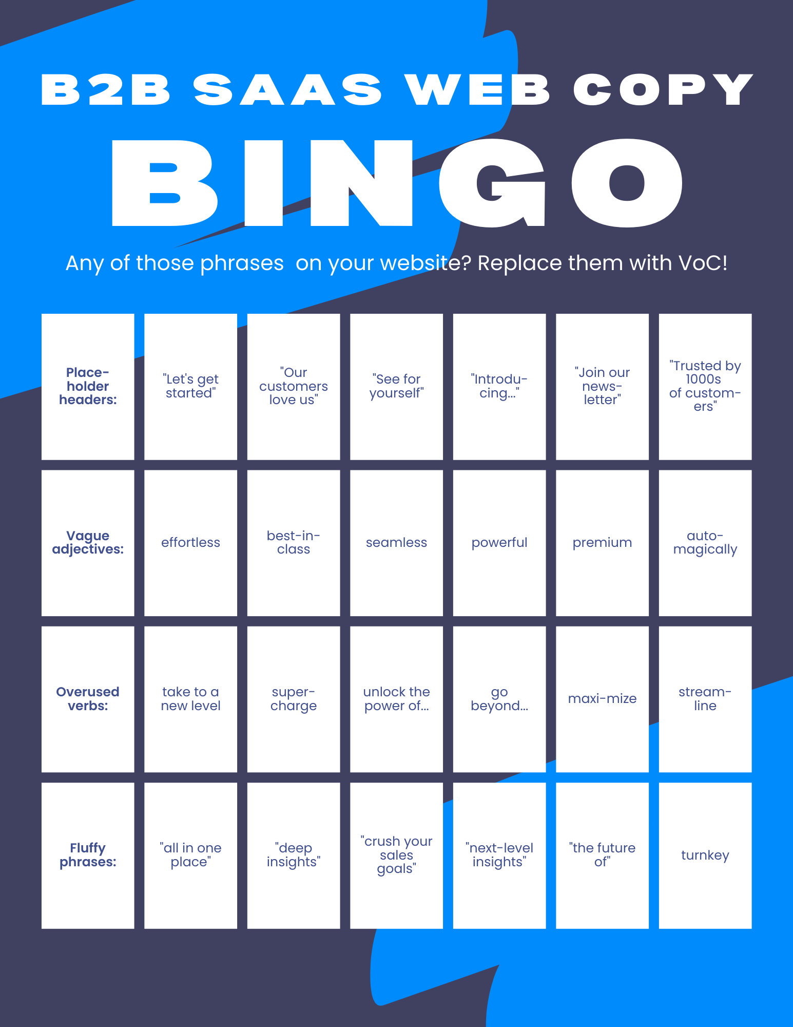
B2B SaaS copy bingo! Many thanks to Nicolas Mérouze, Angela Ferrante, and Beth Carter for their suggestions (email me if your favorite is missing).
Call to action: from placeholder to conversion generator
Frequently seen on startup websites: CTA buttons with no additional information about the next steps, or reasons to move forward (or, even worse, barrier-creating wording along the lines of “Apply for a demo” - yes, exclusivity sells, but this is not the right use case for it).
Another (less frequent) CTA issue is the lack of message-matching or different CTAs leading to the same page.
But even that is not the worst-case scenario. The worst-case scenario would be a bait-and-switch approach described in this LinkedIn post (tl;dr version: “I Requested a Demo – But I Got A Discovery Call.”)
Outside of the “our CTA is misleading and makes prospects cancel calls” nuclear option, some of the other ways in which an unoptimized CTA section can be bringing down your conversions:
not addressing prospects’ hesitations (such as “Will this demo call be a waste of my time?”)
not answering the “Why should I do this?”
making the action feel like work (“Not… one… more… sales… call!…”)
not giving prospects any reasons to act now (inertia is a powerful adversary)
not aligning your calls to action with the stage of awareness (looking at you, homepage hero sections with “Book your demo” buttons)

Well, obviously our prospects want to “Apply for a demo”! Or do they?..
Think bigger than button color or tweaking the phrasing — what else can you add (or remove) to make doing the thing feel like the best decision ever (or close enough)?
Another point to make: sometimes, friction can be your friend.
For example, if you’re getting bad-fit prospects that don’t match your ICP — and are still working on updating your website copy — adding form fields to weed out those folks will save your sales team’s time in the short term.
Evaluate your CTA section
Not just your button copy. Headline, subhead, body text, that caption-y small text below the form, visuals, and even on-page placement: they all matter. Based on reviewing all those elements:
- How confident are you that that call to action is exactly what your prospects want to do?
- How are prospects interacting with your CTA section? What are possible reasons for that behavior?
- Is there a way to find out more about the "why" behind their behavior (exit intent pop-up?)
Optimize your CTA section
You may find out that the only thing that's stopping prospects from booking a demo is a preference for self-guided product tours. Or you may uncover something more sinister (like a belief that a demo call will lead to non-stop calls from your sales team). Either way, knowledge is power and you can now brainstorm some levers to get more prospects to sign up:
- Is there anything you can offer to your prospects as an ethical (as in, useful) bribe to encourage them to do the thing?
- Are you aware of any hesitations or concerns that prospects have at this point? Can you address them in your copy?
- If you’re getting “wrong” prospects, does it make sense to add some friction to segment them out?
CTA section: inspiration station
Conveyer: going above and beyond “Book your demo”
If your prospects get what your product can do for them only during their demo call… this is way too late. Especially if it’s not super easy to imagine the future with your product.
Some comparatively low-effort ways to overcome this before prospects land on the demo signup page are:
screenshots
recorded demos
templates
playbooks
in-depth customer stories
personalized demos
use case pages
But Conveyer takes it one step further and offers to create an example of what their product can do — in just one week.
Is this scalable? Probably not.
Is this likely to work better than “Sign up for a demo”?
I’d say yes.
Watching a demo is not the same as being able to play with your very own transformed PDF manual and see all the opportunities that can be unlocked with this new format.
Mesh: reasons to hit those hero section CTA buttons? Plenty.
You could follow a template… or could find a new way to display impressive results you’re able to get for your customers right in the hero section.
Need more inspiration? 5 questions to help you run a high-level audit and generate more website optimization ideas
These are the questions I use to run research and discovery before moving on to writing copy:
What can we infer from the website data (conversion rates, visitor behavior, scrollmaps, heatmaps, session recordings)? What are some possible reasons for low conversion rates?
Some examples: confusing value prop, lack of product information, unnecessary friction in the signup form.What is known - and assumed - about ICPs internally? What are the (relevant) knowledge gaps?
Some examples: their job to be done, primary and secondary motivators, must-have info to move forward with the buying process.What do we need to find out - and what’s the most efficient way to do so?
Some examples: customer interviews, messaging panel, review mining (or all of them).How does what we’ve learned make sense with the competitive landscape, economic changes, and buyer journey?
Some examples: learning what customers consider to be the top differentiators, identifying top reasons best customers choose the product, adding buyer enablement documentation to the website roadmap.What should we say to attract the best-fit prospects, move them through stages of awareness, and turn them into customers?
Some examples: identifying the primary desired outcome for key ICPs, identifying a gap between existing blog post content and the next best step for the prospects, finding missing information that prevents prospects from considering the product.
For more details, watch this YouTube playlist on how to research, for B2B SaaS startups (or you can hire me to run the audit for you).

I help B2B SaaS startup founders and marketers get more traction with research-driven conversion copy — without slowing down their growth initiatives.
Hire me for:
Customer research to ramp up your growth
Website audit to find & fix conversion blockers
Day rates to optimize your landing pages, web copy, or email sequences for more clicks and signups