"Do NOT look at your competitors' websites" (or should you?)
"Just ignore your competitors!!!" advice is only worth following if you read it as "Just don't copy your competitors' website copy, offer, and structure!" (which is a great tip).
The reason: context. As in, the context in which your prospects are making their purchasing decisions.
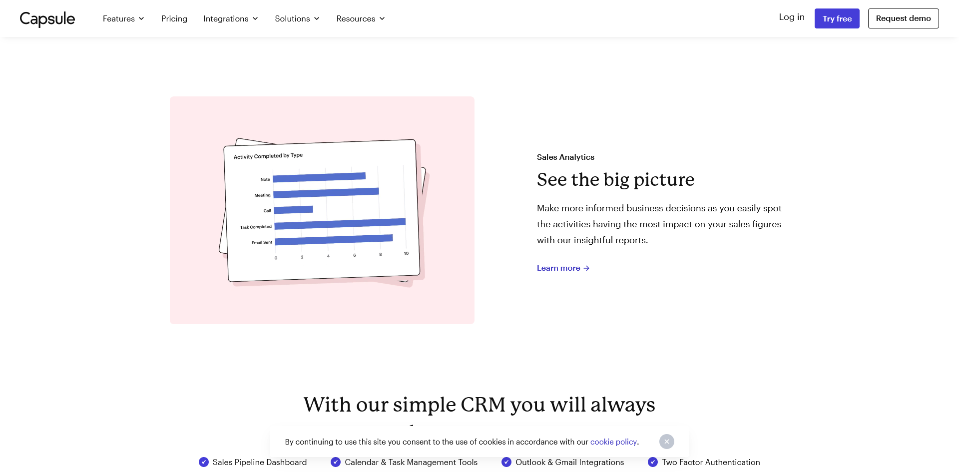
Imagine you’re building a new CRM for small businesses. But there are so many — way too many! — competitors. How can you possibly stand out? Should you just copy what your competitors are saying
You shouldn’t do that, obviously. But, ignoring your competitors is also not the answer. Your prospects are making their purchasing decisions within a specific context that includes looking at competitors’ solutions.
Looking at competitors’ websites can help you answer these questions:
table stakes for the industry
existing differentiators
common messaging themes
the most common offer
overused terms
memorable plays (as inspiration)
What are the table stakes for the industry?
Some examples:
features that literally every product has
common website architecture setups
types of social proof
Why this matters: this is table stakes — things that are expected. Especially features.
Example:
All CRMs allow you to manage contacts, calendars, and tasks, plus manage leads and lead-to-customer milestones. Definitely table stakes.
Are there any common messaging themes?
For CRMs specifically for small businesses, these are ease of use, affordability, and time savings.
Why this matters: nobody’s looking for a hard-to-use, overpriced, time-consuming CRM, so what else can you say about your product?
Example:
Common emotion-driven themes include feeling in control, the (oh so exhilarating) feeling of not having to fight a CRM to get things done, and being able to make business decisions.
What is the most common offer?
Why this matters: if all of your competitors are offering a free trial, you’ll need to have a very good reason not to offer one.
(Or, you could consider additional levers to make your offer more appealing)
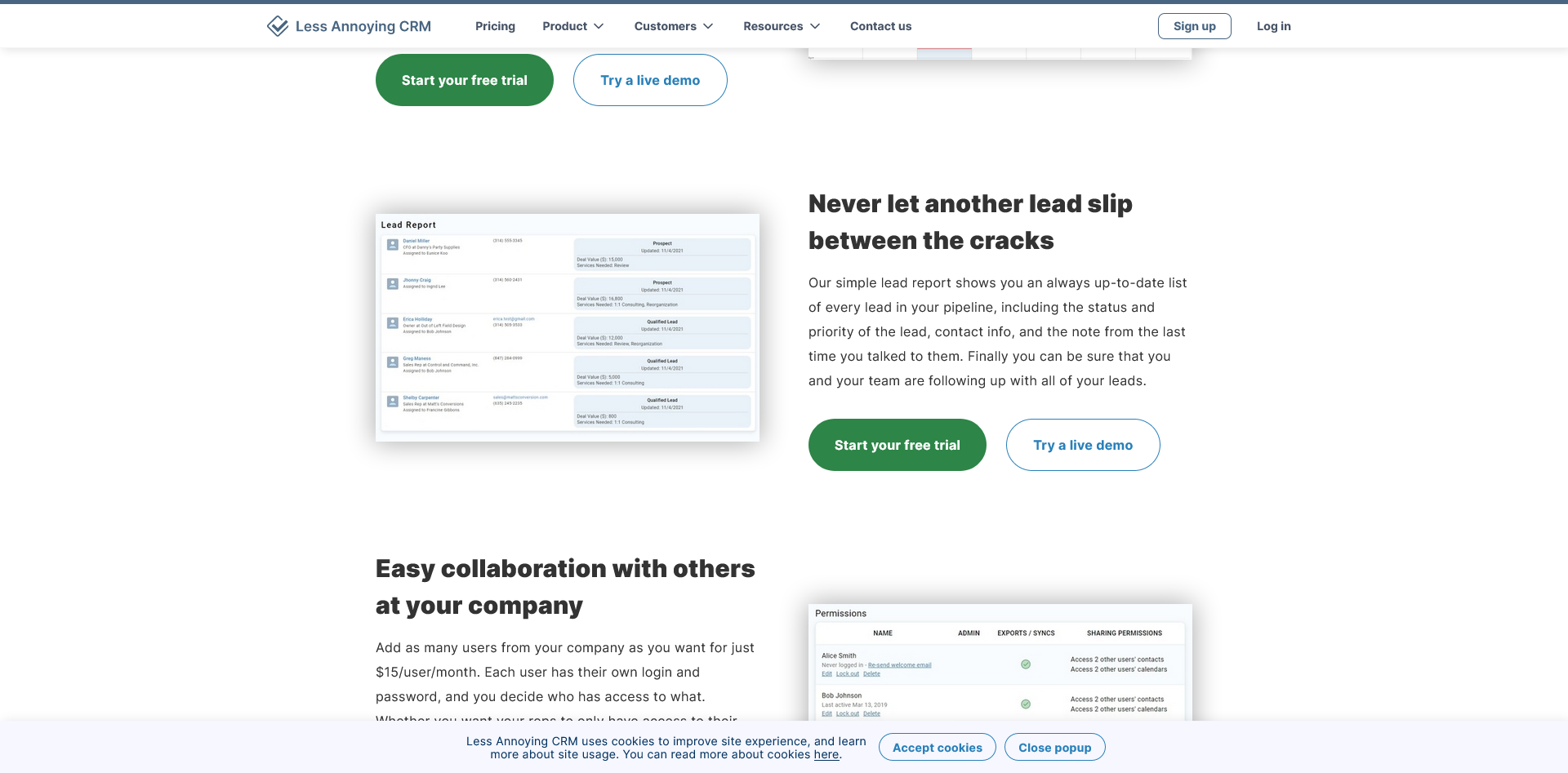
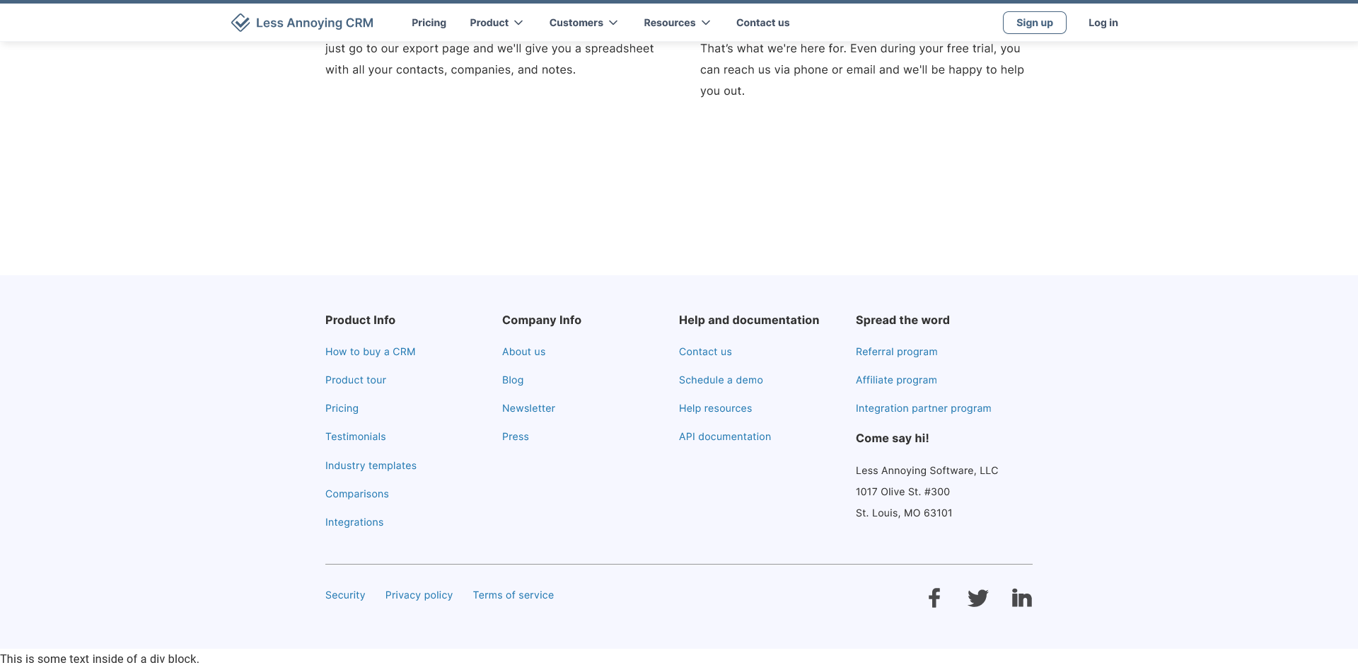
Example: “Start your free trial” for CRMs is table stakes. So is “Sign up for a demo.” But, LACRM is offering a live demo that is ungated — an opportunity to “show, not tell,” or a distraction?
That depends on your audience.
Do all websites sound the same?
Are there any overused phrases or terms that should go on the “Do not use” list?
Why this matters: pushing past generic marketing fluff to get to specific frustrations, motivations, pain points, and desires.
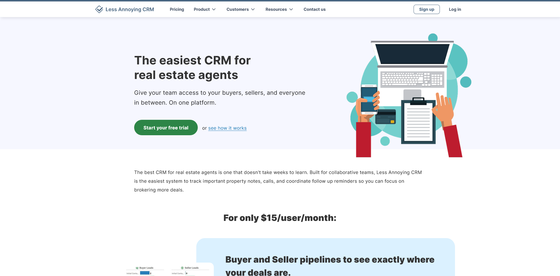
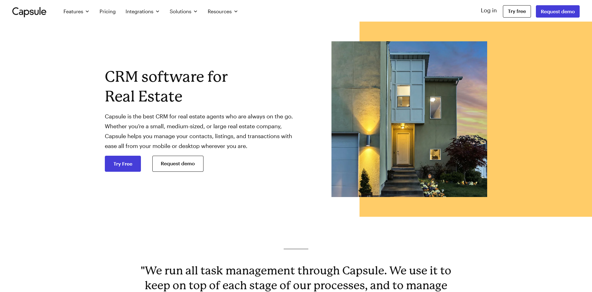
Example: “Our CRM for Real Estate” pages — “always on the go” may be a good one to stay away from
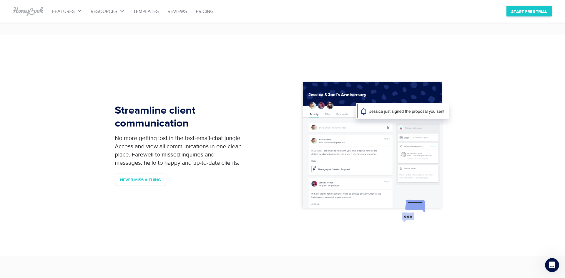
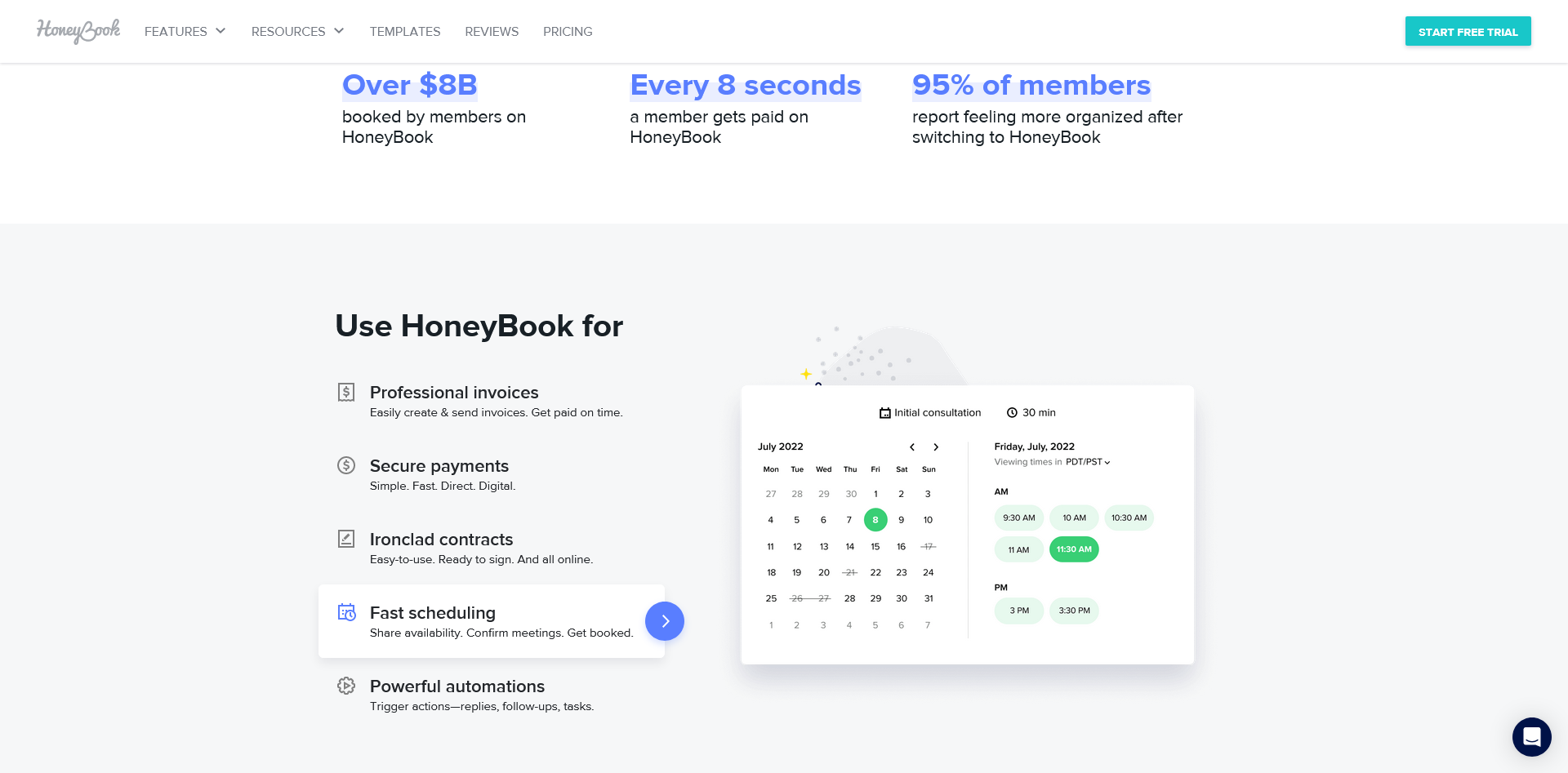
As a side note: HoneyBooks has a different approach.
Instead of industries, the focus is on independent professionals. Whatever their industry, the pain points are the same — and so are the “must-haves” for a CRM.
Any memorable plays?
Not to copy word-for-word, but to see if they make sense for your audience. (You don’t know what’s really working for your competitors, so use this with caution.)
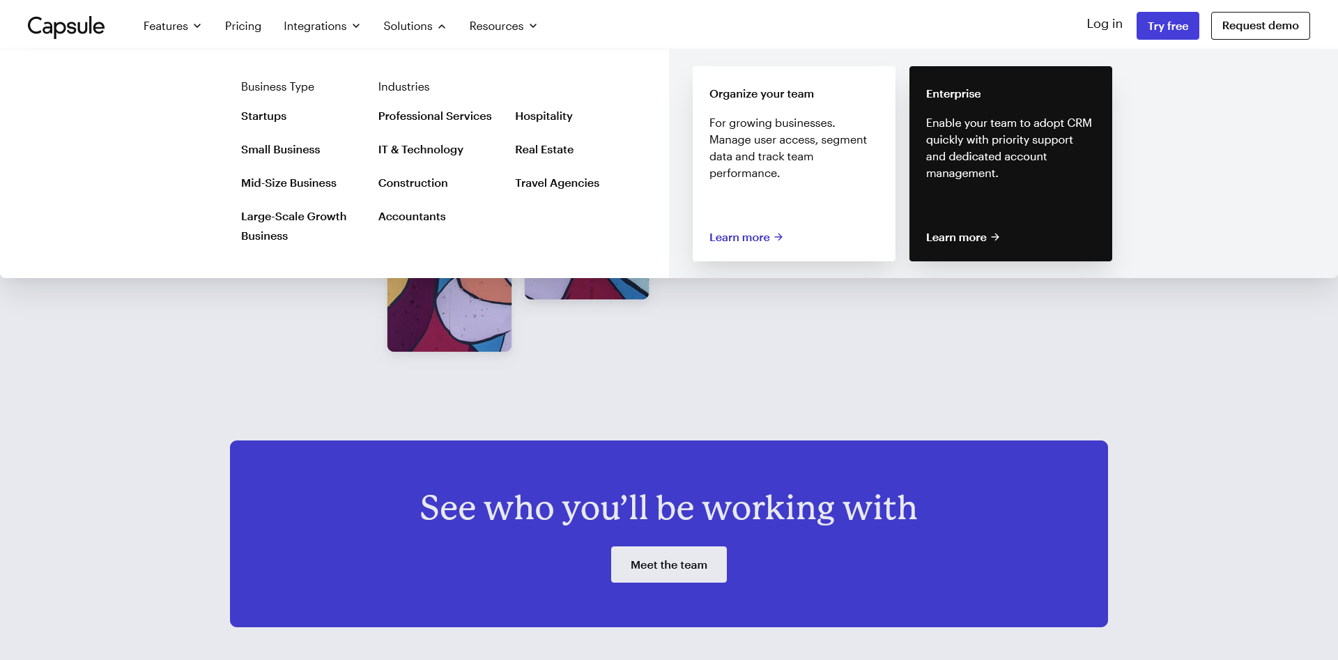
Examples: menu layout, partnerships, and my personal favorite: homepage + JTBD approach to presenting the features & connecting them to the pain points. Possible “Could this work?” plays could also be affiliate programs, or structuring your sub-menu options by industry size.
Which of the plays would make sense for your company depends on your product and your audience:
How is your product different?
Why does it matter to your audience?
What do they hire your product for?
What can they achieve?
Looking at competitors’ websites can help you build out some initial sets of assumptions about the landscape and how to stand out.
Talking to your prospects and customers can help you validate them.
tl;dr
Competitors’ websites can tell you about:
Industry-wide expectations
Overused terms and messaging themes
Common approaches to website architecture
Most common offers
Here’s a template to kick off your research:
I help B2B SaaS startup founders and marketers get more traction with research-driven conversion copy — without slowing down their growth initiatives.
Hire me for:
Website audit to find & fix conversion blockers
Day rates to optimize your landing pages, web copy, or email sequences for more clicks and signups

