
A guide for when you don’t know where to start fixing your web copy
11 best practices that
break B2B SaaS websites
Best practice tips aren’t wrong.But they are also not magic.
I’ve worked with dozens of startups on optimizing their website for conversions.
In many cases, the starting point was following the best practices.
In this guide, I’m listing the best practices that often get in the way when taken at face value.
What actually matters — and what I see making all the difference — is being able to decide when — and how — to apply best practices in a way that makes sense for your industry, your buyers, and your GTM motion.
This is especially true for sales-led B2B SaaS startups. When their websites start underperforming, it’s often in part because most best practices are more helpful for PLG motion, where all you need to do is get your prospects to start using your product.
But if you’ve got multiple stakeholders and a complex product, you’re better off writing your website to get on the shortlist.
Which is a different situation.
Keep reading to see how to run a sanity check before making website changes, which questions to ask yourself instead, and when to break rules to get more qualified, warm leads (with examples from my past projects).
Run a sanity check before going all in on one of those:
Write short copy, nobody reads online
You absolutely should make your copy easy to read or scan. But it doesn’t mean that using more than 3 words in a headline or more than 2 lines for a paragraph is “bad.”
Instead, ask yourself:
Is it clear what my product does, how it’s different from competing solutions, and who it’s for?
« This
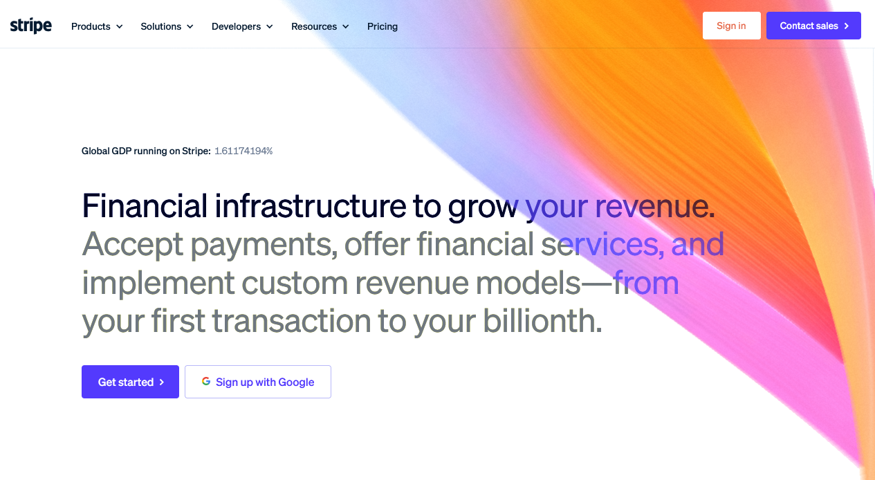
Stripe is, shall we say, pretty well-known, but they still explain what it is that they do. In a headline that takes up 4 lines in their hero section. Sometimes, it’s worth expanding your headline.
(Something cool I don’t see often: using the eyebrow copy space for credibility-building)
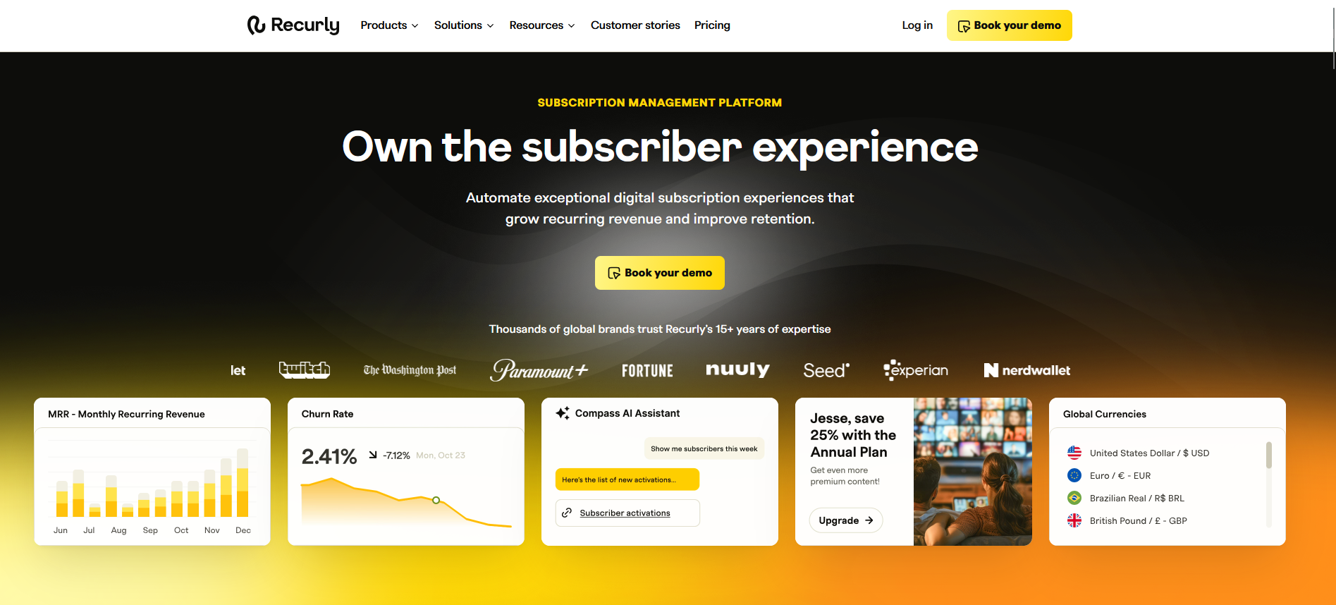
« And this
Recurly keeps the headline aspirational and explains what can be done with the product in the subheadline. Notice that the eyebrow copy is clearly stating “what,” freeing up the headline and the subheadline to talk about “so that” and breaking down the JTBD.
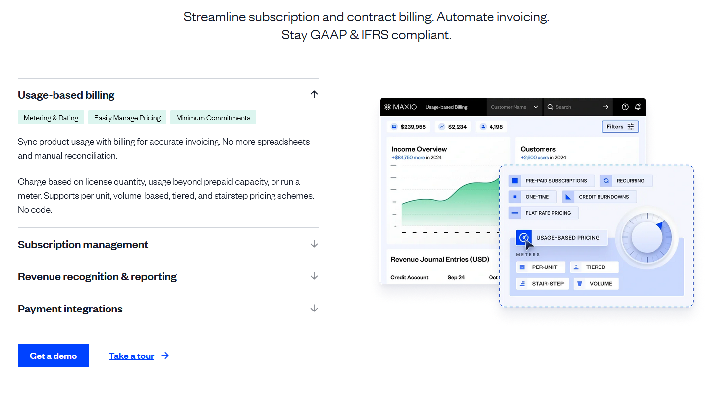
« Also this
The green buttons in Maxio copy aren’t actually buttons, but they help avoid visual overwhelm and another 3 lines of text. If you want to find out more, you can keep reading the text. If not, you can click over to the next set of capabilities.
Not that »
» Making page structure decisions based on keeping it “too short”
» Making copy decisions based on character length
» Skipping feature clusters or whole sections because “everyone has them”
(your prospects want to know if you have them, don’t make them guess)
Side note:
You don’t need to add content for the sake of content. Rather, it’s about understanding how your ICPs shop for similar solutions and what they need. And accounting for the fact that your copy needs to work harder, because you’re not the default solution (yet), and making it easy to see why they should choose you.
For example, in one of my projects a strong signal for expanding the page instead of keeping it focused on high-level capabilities was website visitors scrolling up and down the page and doing multiple U-turns.
When it looks like your prospects can’t find something, it’s generally a signal that the copy isn’t providing enough context. An exit intent pop-up survey should help you get some initial ideas of what’s missing.
You should lead with the ‘why’
It’s not wrong to have a reason to build a product that goes beyond “solve a problem that market needs solved.” And for some audiences, this will be a valid, real differentiator. But it’s not going to be in every case.
Instead, ask yourself:
Do our prospects care? Does our ‘why’ matter more than capabilities, fit for their JTBD, or outcomes?
If yes, by all means, lead with the why.
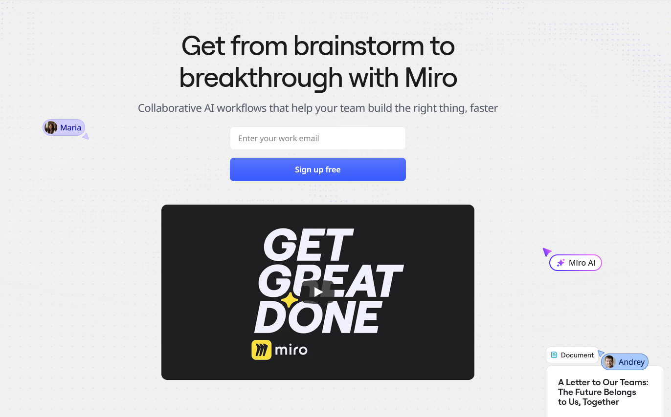
« This
According to this HubSpot article, Miro’s mission statement is “Transform the way people work together by helping them collaborate better. Faster. On everything. From anywhere.”
What the readers care about: getting “from brainstorm to breakthrough.”
It’s right there, in the headline.
Not that »
» Focusing on the “why we’re building this” when your audience doesn’t care
(Rule of thumb: if you’re building a product because you’ve experienced a specific problem and want the industry to do better, that’s giving you additional credibility. If you’re starting a sentence with “The future of…” it’s worth checking if your audience considers the future of the industry to be their most pressing concern.)
» Prioritizing a mission-driven differentiator over other differentiators that don’t feel quite as strong because it’s “unique”
(Instead: stack those weaker, but more relevant differentiators, as Clay Ostrom shows in this post)
Side note:
“Learn about our why” makes sense for early-stage startups, especially if the founders are already known in the industry and can connect the dots between their frustrations and the solution they’ve found for the market.
But even then, I would want to triple-check that your “why” is strong enough to take over the hero section.
For most B2B SaaS startups, it’s a secondary credibility builder, not the primary attraction.
For example, messaging tests can show you how important this is to your audience (and whether your why might be re-purposed as a letter from a founder instead of the hero section, like in this example).
You need to write for personas
Absolutely yes! But which ones? This changes depending on your stage of growth — and based on how your customers are researching and buying solutions like yours.
Instead, ask yourself:
Across all relevant personas, when are they going to be involved in the sales process?
How different are their jobs to be done, really, or the way they research products?
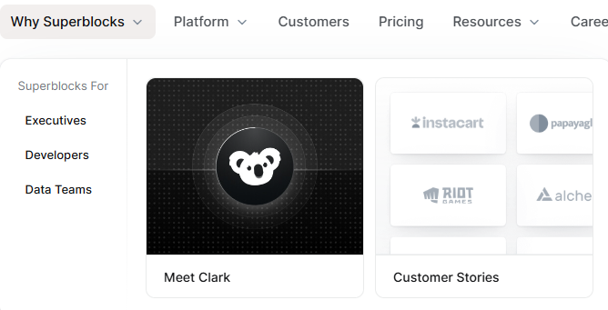
« This
Superblocks doesn’t overcomplicate their homepage top nav and includes video testimonials from C-Suite folks on the page — signaling that they’re writing for decision-makers.
Now, once you start poking around for “Superblocks alternatives,” the competitor comparison page has a different menu that includes a breakdown for developers, data teams, and executives.
Because it’s not only executives that are involved in buying.
« And this
A lot of folks focus on writing for personas by default. A must-have for cold outreach.
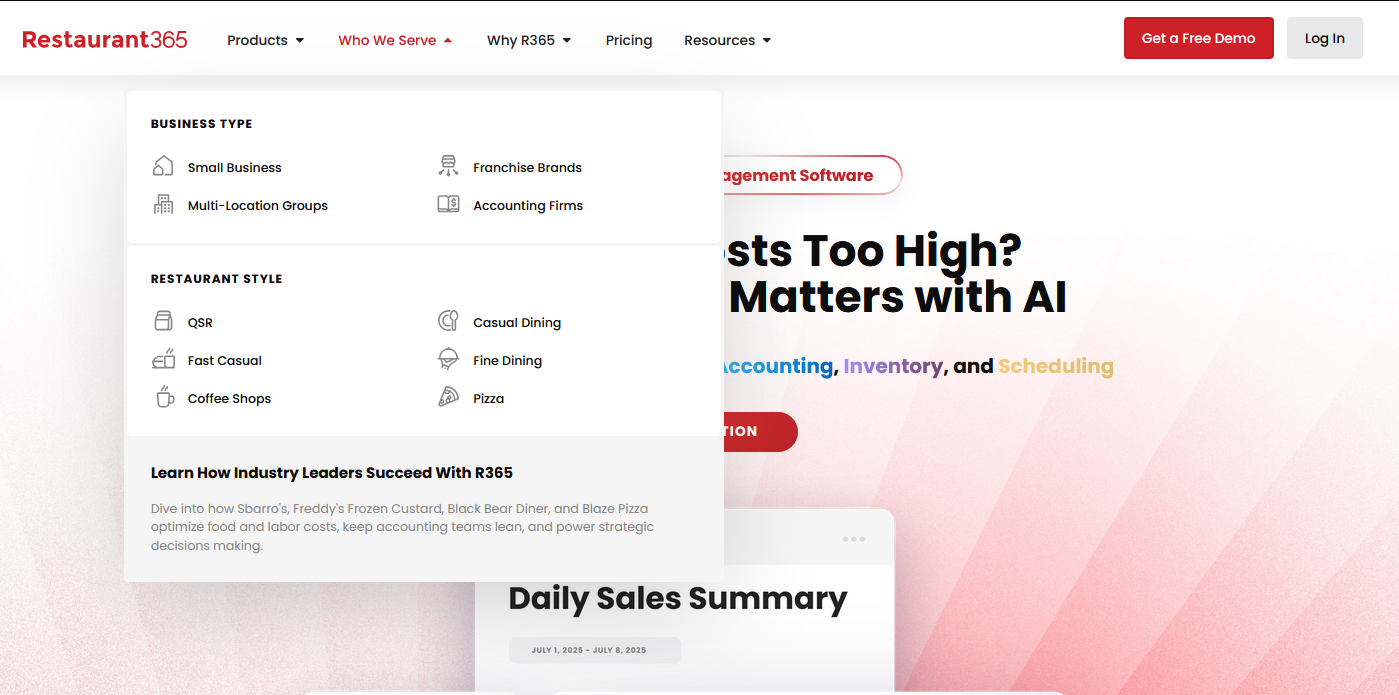
But when prospects arrive at your website, they’re more likely to care about a specific JTBD or a solution that has been proven to work for a specific type of company. Like a pizza restaurant or a coffee shop for Restaurant365.
They’ll be using the same features and have the same goal. But the question they’re likely asking themselves is: “Will this work for my type of restaurant?” And industry pages help answer that.
Not that »
» Building role-based personas into the website based on assumptions about what they care for and how they shop
» Prioritizing personas over JTBD and fragmenting your messaging as a result
» Overselling the C-Suite with the assumption that they’ll be the ones visiting the website and researching solutions (or are they…?))
Side note:
This one can be tricky, especially because there’s no shared understanding of what a good persona description even means — and how much of it can be reasonably assumed (read: made-up). Early on you have to go with best guesses to test assumptions, but once you reach growth-stage, it can backfire: copy doesn’t resonate, there’s no unified messaging, only role-based fragments divided further by industry.
In most cases, this fragmentation makes sense for paid funnels where you can control who sees the page and create persona-specific messaging. But for web copy, it can be hard to zoom out of the persona-based fragmented view and find a resonant, unifying message without overshooting and ending on the side of high-level platitudes.
3 things can help avoid this:
[1] sense-checking against JTBD
[2] understanding how personas participate in the buying process, and
[3] building strong unifying messaging.
The most important thing to understand here is what triggers your prospects’ search — and who exactly runs it. That determines how to frame both the problem you solve and the way you break down the capabilities.
For example, you may find out there’s no set role or department that consistently shops for your solution, as was the case for my clients. For some of them, it made more sense to focus on industry pages. For others, re-designing around jobs to be done was a more logical choice.
If you’re not sure which makes sense for you, your sales team might be able to help. You can also try adding a thank-you page survey or an open field to your demo signup form to understand the search triggers.
Your website should appeal to your TAM
Writing for TAM means that you’re also writing for people that aren’t currently shopping for a solution, aren’t researching different approaches to fix a pain point, and aren’t really in the buyer mindset. So by definition, your web copy and messaging become diluted.
Instead, ask yourself:
For your ICPs, what triggers their search for a solution like yours?
How do they research available options?
What do they believe about the solutions — and their industry?
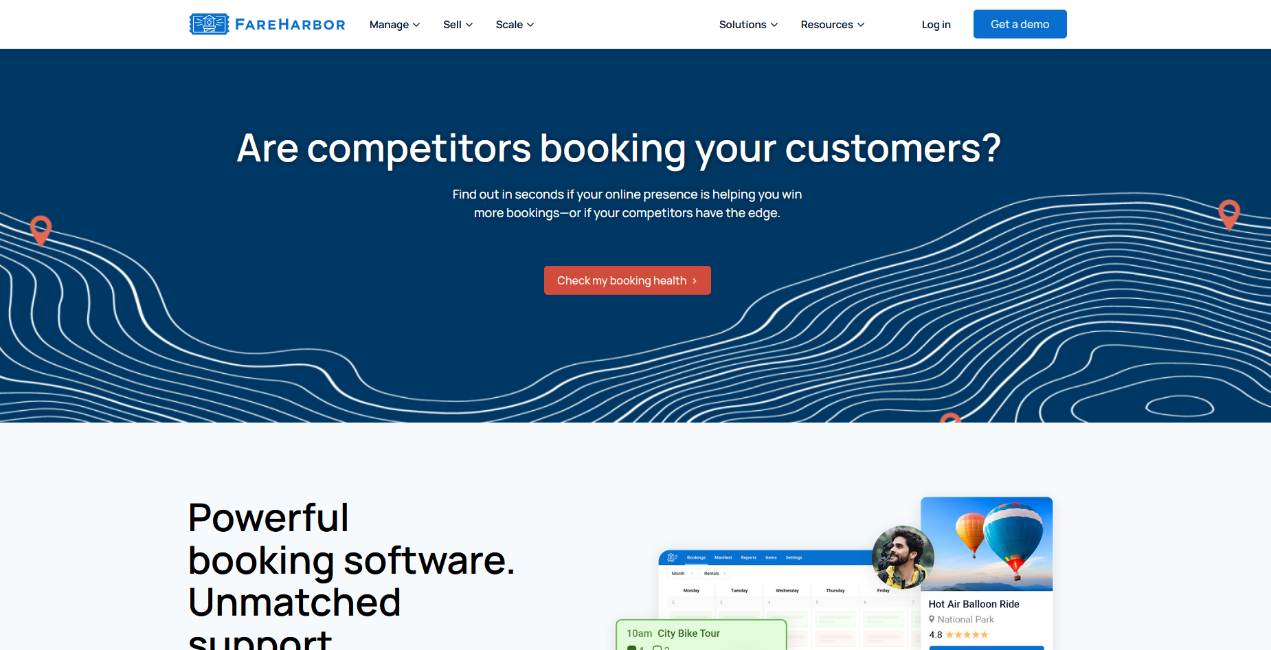
« This
Fareharbor is essentially making their homepage into a lead gen page, kicking it off with a pain point: competing for customers. If most of your audience is actively solving a specific problem, that might be the way to go.
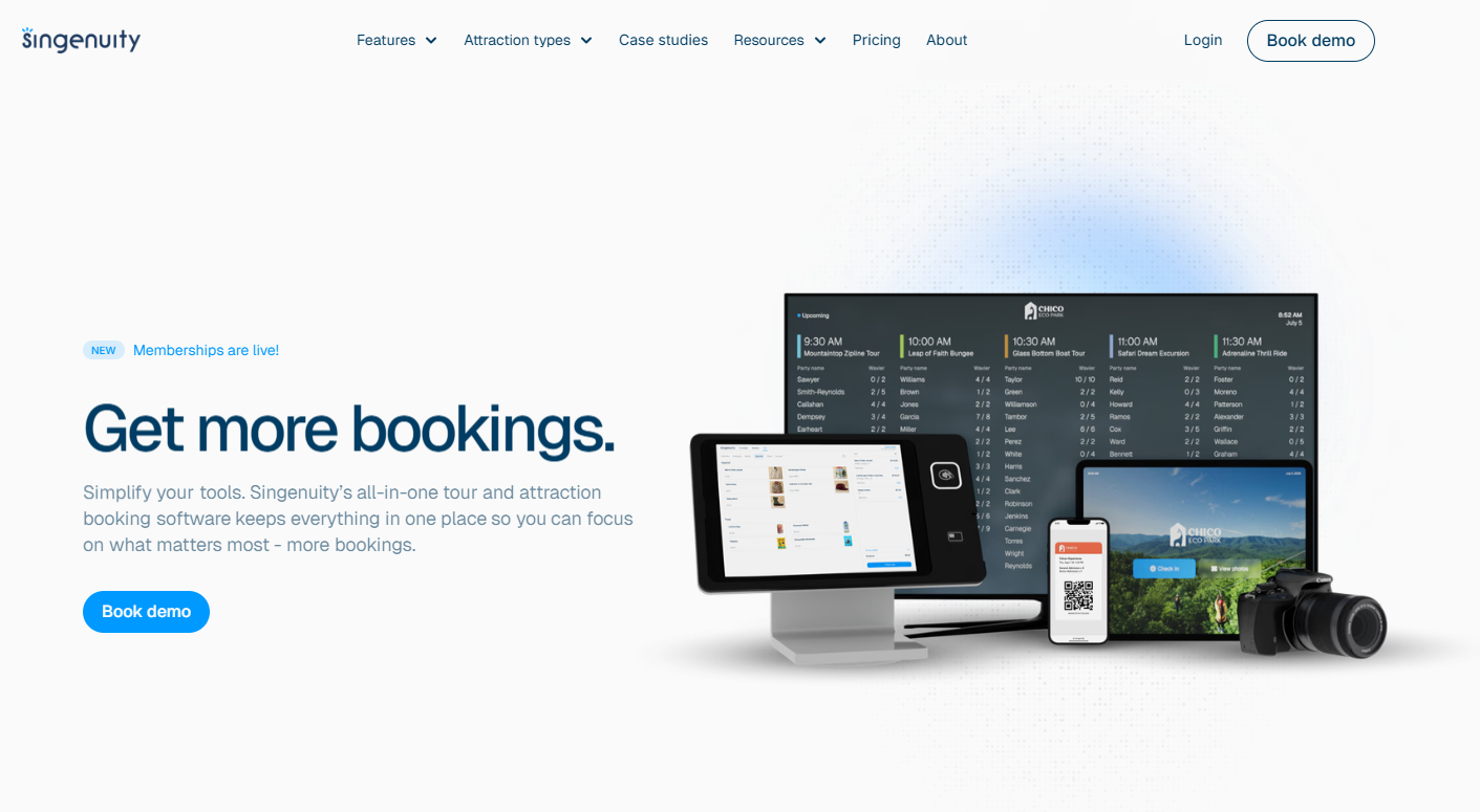
« Also This
“What do we want?!” - “More bookings!”
“When do we want them?!” - “Now!”
If you can define the outcome that your audience is chasing (because you know what triggers their search for a new solution), leading with that helps your readers quickly decide whether or not this product is for them.
This is exactly what Singenuity does.
Not that »
» Trying to convince your market that they have a problem (demand gen is a totally valid initiative, but it doesn’t necessarily belong on the core website pages
» Diluting messaging so much to appeal to everyone in your target market that your copy could easily belong on any other website in your vertical
» Following the lead of incumbents instead of comparing and contrasting for the segment that get more value out of your solution (more on that under “Be like Figma”)
Side note:
I find that “We do X” messaging (or, in extreme cases, “Feature 1 and Feature 2” messaging) on the homepage is a sign of writing for everyone. To be fair: homepages are super hard. And there’s no control over who lands on the page.
That said, if you expect your website to bring in demo requests, even the homepage hero section needs to give your visitors a reason to care.
(Unless your product is the default solution for this category, in which case it’s a very different situation.)
Another example where “writing for everyone” pops up is when there are multiple markets, products, or applications for complex products. In those cases, trying to combine them all on a single page or find high-enough-level of messaging on product pages makes the copy extremely generic.
In those cases, the answer might be breaking out separate pages by product, industry, or use case to create space for specificity.
Either way, you should be able to point to specific search triggers and search goals for your prospects that would make the copy relevant. Whether it’s switching from a different solution or realizing they need to solve a specific problem once and for all.
Just focus on benefits…
Sometimes, a combination of “nobody reads online” with “just give them the benefits” and “we need to write for decision-makers” creates a visually stunning, but information-poor websites. Or sells the solution short, hiding its unique strengths.
Instead, ask yourself:
(1) Are the benefits listed on the page relevant to your best-fit customers (instead of “everyone who might conceivably need our solution”)?
(2) Are you also making sure that you include the information that would move your readers closer to converting?
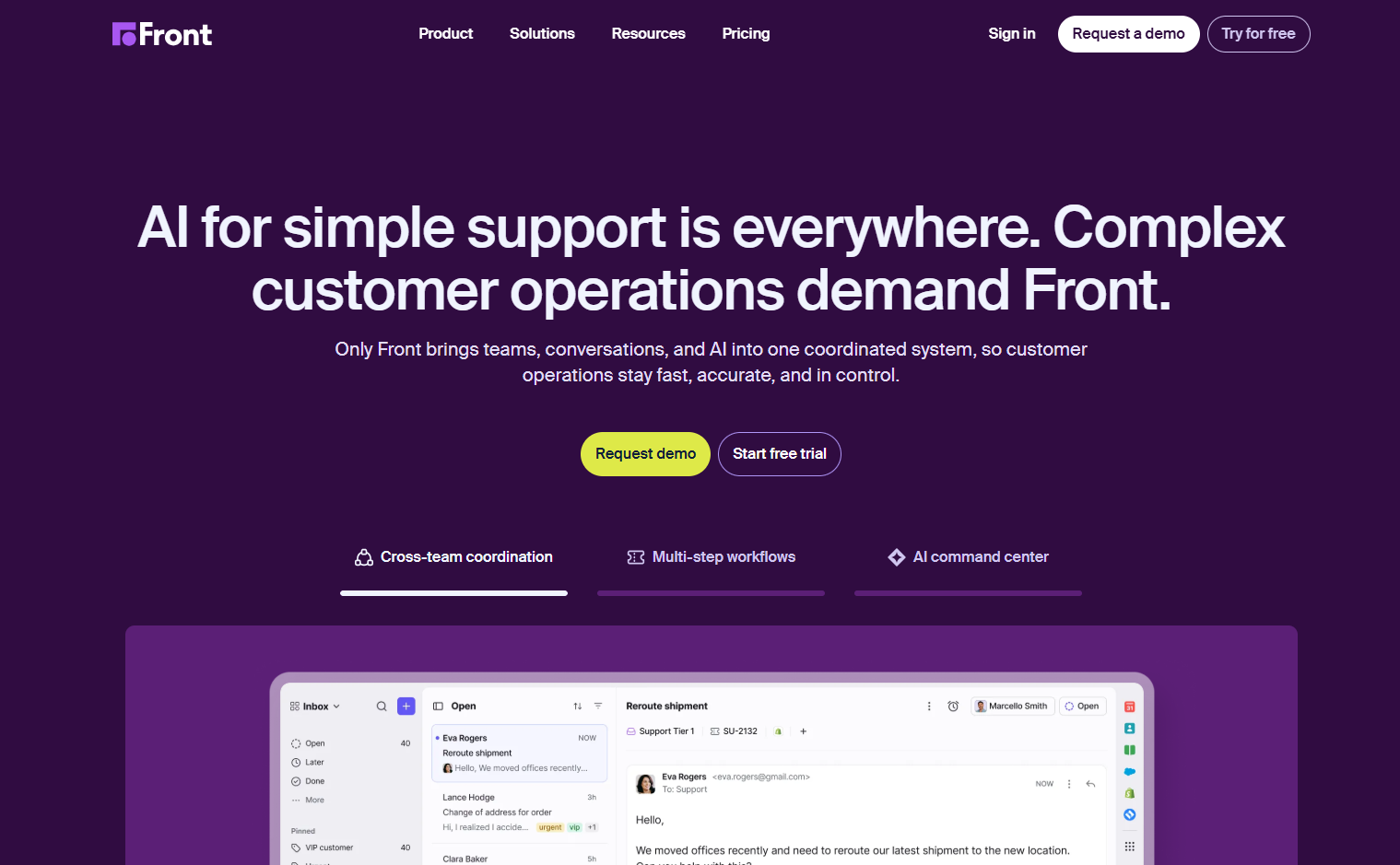
« This
Front puts their differentiator right in the headline, makes it more specific in the subheadline, and then shows 3 examples, clearly marked with labels, underneath.
Instead of benefits, clear reasons to find out more.
« And this
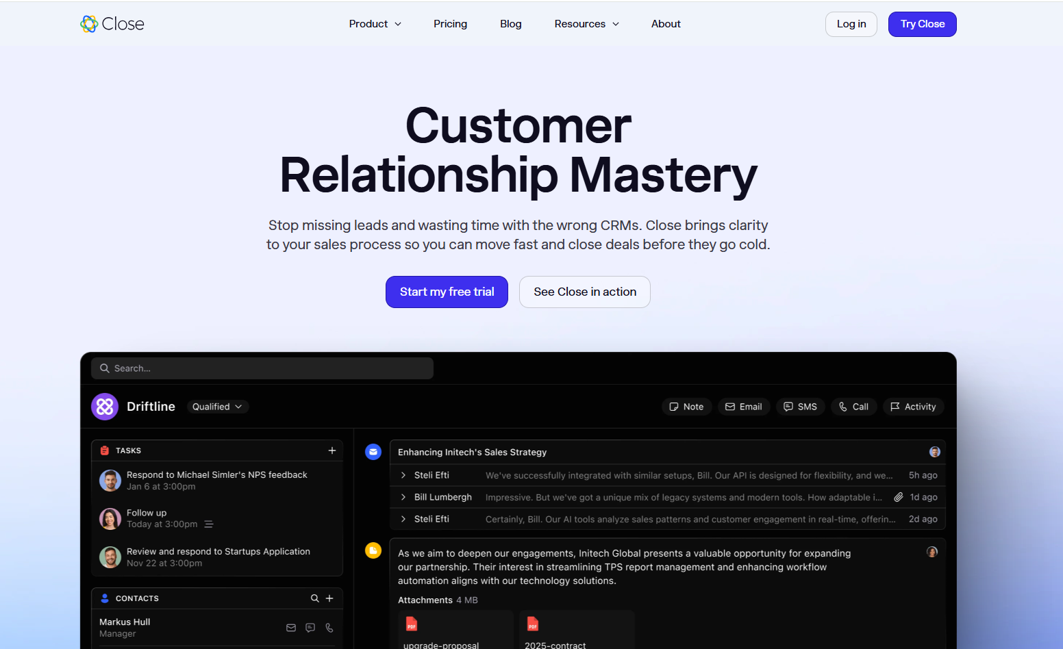
Switching to a different CRM is a nightmare.
So Close leads with the desired outcome (and strong emotional pull) in the headline and reminds about the stakes in the subheadline. And connects to the “so that…” after setting the scene.
(Instead of going with “Move fast and close deals before they go cold” as the headline — not a bad option as such, and also not the ultimate desired state.)
Not that »
» Focusing on short, benefit-oriented copy.
» Skipping information on how your product works and what it does differently.
» Excluding sections that highlight the stakes or the pain of staying with the current solution
(especially when there’s a lot of friction around switching)
Side note:
I’m sticking to the hero section examples for this guide, but stakes get even higher for feature sections.
Nobody needs a feature dump with no context or connection to prospects’ goals, but at the opposite extremes you get copy that’s all benefits, and no details, leaving readers (especially primary users) wondering, if your product is easy to use, can be adopted without too much IT pain, and will be an improvement on their current setup.
“Show me your product” is a recurring theme in messaging tests, so show it and tell them about the way it works.
Interactive demos are also nice.
…make it company-level benefits
Especially if you want to attract more enterprise-level customers, it might seem like the best thing to do is shifting to messaging that makes sense to the decision-makers. The risk is the same as with writing for your TAM: you might make your copy too generic.
Instead, ask yourself:
Who initiates research — and what are they looking for as they compare solutions?
How does writing about company-level benefits fit into this?
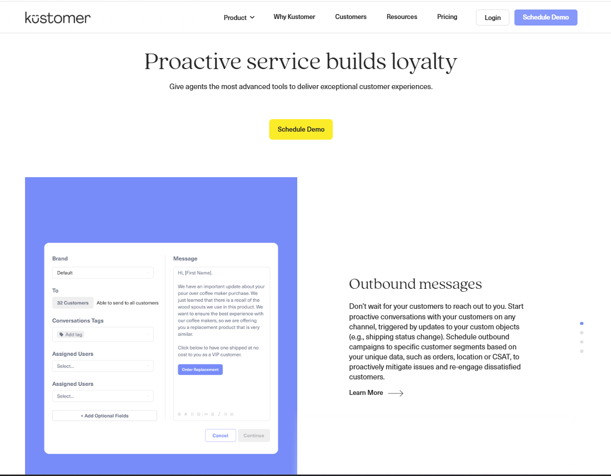
« This
The feature section starts with a broad statement, but breaks out exactly what “proactive service” means — and how it can be helpful for specific use cases.
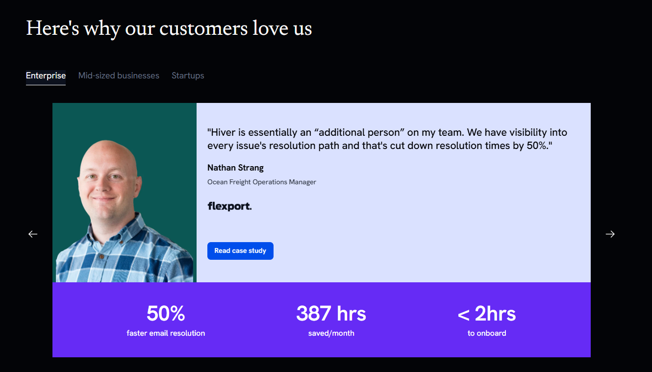
« Also This
You can also map out features, benefits, and proof by the type of customer the way Hiver does with their testimonial block and KPI proof points.
Not that »
» Forgetting to balance the needs of different types of readers and/or prioritizing the group that gets involved at a later stage
» Skipping user-level and/or team-level benefits in addition to company-level benefits
» Assuming that all different types of readers will be moving through the same set of page and not providing different “Choose your adventure” paths depending on their role, industry, or JTBD.
Side note:
Figuring out how all pieces connect to make it easier for different types of prospects navigate your website and find the info they need is one of the most interesting and challenges, and this is where it’s especially easy to overthink things, give up, and go with the “keep it high-level” approach instead. Depends on the market, the ICP, and the product.
That said, the most common scenario I’m running into is not providing enough context for prospect. Not prospects drowning in too much information when all they want is to throw their money at you.
Not sure if you need to be writing for the C-Suite? For the users? For a combination of both?
Your sales team likely holds most of the answers. They know exactly who initiates the conversation and when other departments become involved.
And — most importantly — the objections each of them brings.
If you know that your conversion rates are low, ignored objections are more likely to be an issue than the lack of company-level benefits. You absolutely need to show the ROI, but that’s what case studies are for.
Copy this list of questions you can ask your sales team to troubleshoot your copy.
Don’t use jargon
This gets fuzzy because there’s no definition of what “jargon” means. Using industry jargon and references to inside jokes can be a credibility booster as a sign that you’re a part of the group. For some verticals, like technical products, this best practice can backfire.
On the other hand, if “jargon” means “marketing-speak that doesn't mean anything but clutters web copy anyway,” then it makes absolute sense.
Instead, ask yourself:
Does the website copy mirror the way our ICP talks about their problems, pain points, and solutions?
Does the way we use jargon make us sound more trustworthy (or like we’re trying too hard)?
« This
Right kind of jargon (if it’s about the thing your product does, it belongs on the page).
« And this
Mailchimp says things like “grow faster — while stressing less” in their headlines. In the CTA section, recapping what’s included in your free trial or chosen plan by calling out features is also the right kind of jargon.
Not that »
Use the bingo card to see if you can make your copy stronger by getting rid of marketing fluff, overused verbs, placeholder headlines, or vague adjectives.
In my experience, they sneak by when marketers jump straight into writing without running voice of customer research first, and end up with high-level, generic phrases on the page.
Side note:
Voice-of-customer programs, from surveys to customer interviews, to un-creepy social media stalking can help you make the call between “useful jargon” that makes you a part of the in-group and “fluff everyone puts on their website” because everyone keeps reading the same websites. And, at some point, comic books about caveboy inventors (“This will change fire as we know it” is now a catchphrase for startup-y copy in my household).
Another risk of jargon-y copy is that sometimes even folks in the same industry don’t agree on what it means. I’ve had a project where messaging tests showed a gap between real and expected capabilities because there was no common understanding of the category label.
Sound like a friend at a bar
Which friend? Which bar? What’s the goal of the conversation?
It’s a catchy way to remember to sound like a human, but just as “write as you speak,” it can be misleading when taken at face value. Yes, you don’t want your website to sound like marketing copy in the worst sense of what “marketing copy” means. And at the same time, it’s still supposed to convert prospects. One might hope that’s not the case for conversations at the bar (unless it’s a karaoke night and you really want your friends on the stage? Still not necessarily applicable for B2B SaaS context).
Instead, ask yourself:
What do my prospects sound like when they’re discussing the challenge that my product is solving?
What types of websites do they trust? What do those websites sound like?
« This
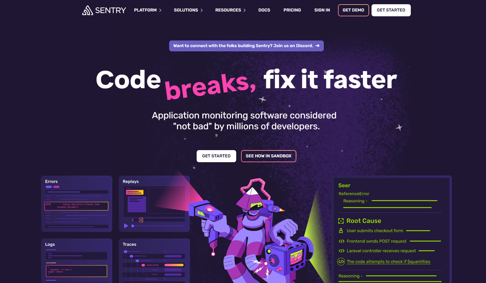
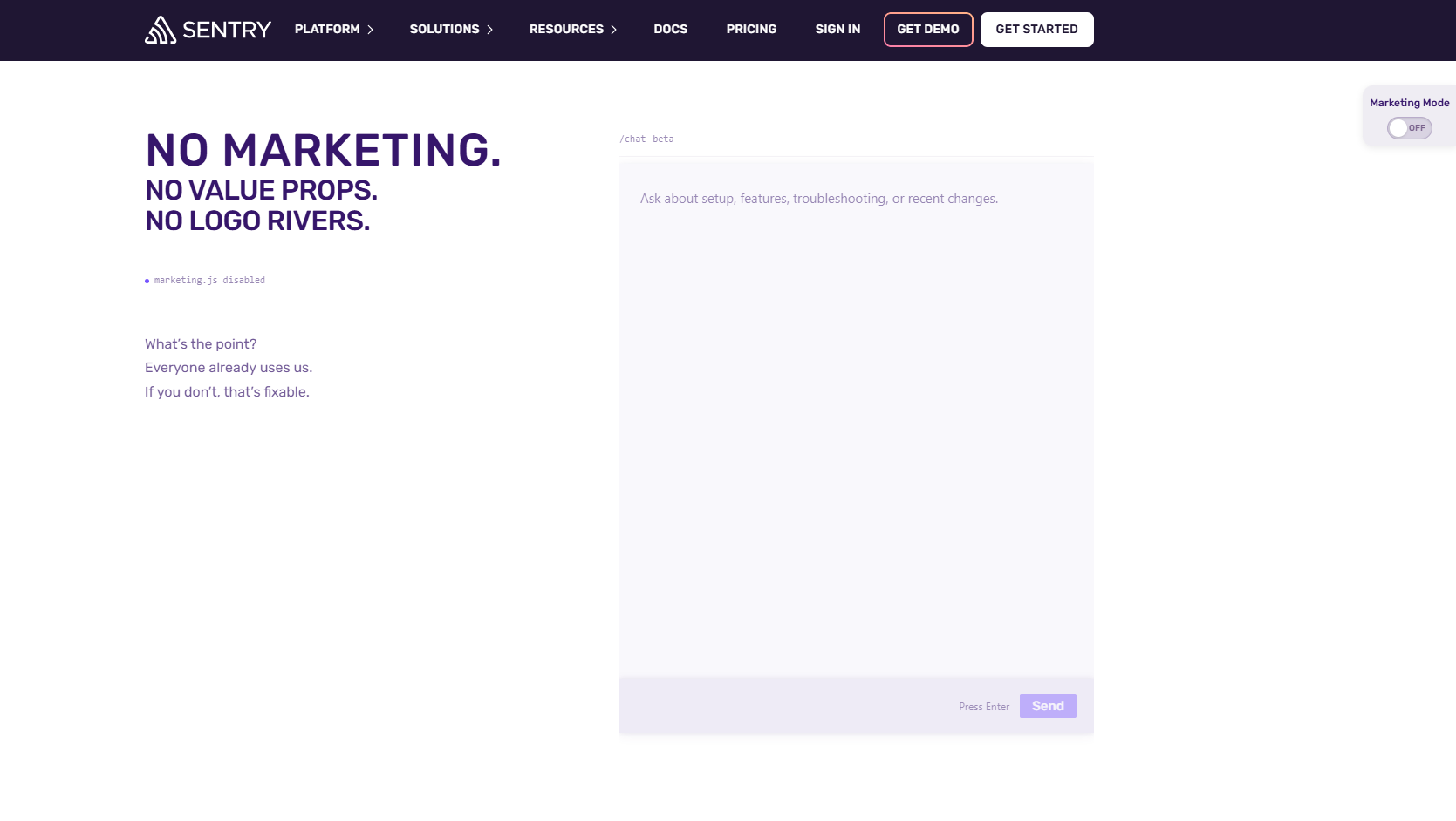
Marketing to devs is my favorite example of “read the room” audience that’s allergic to marketing fluff.
Sentry is a great example of reading the room: not only do they have “in” jokes like “Application monitoring software considered "not bad" by millions of developers,” they also have a “marketing mode” toggle on their homepage.
Toggling it off leads you directly to a page with no marketing copy (kind of) + a chat to ask about features, changes, or troubleshooting.
Not that »
» Assuming that competitors have dialed in their copy and what they have on their websites should work for you as well
» Skipping voice-of-customer research and/or testing how your copy comes across to your target audience
» Defaulting to a three-word brand voice description without further defining what it looks like for your brand (“friendly” is the weasel word of brand voice guides).
Side note:
Can a SaaS brand have a distinct, relatable, memorable voice? Of course!
Should it be the differentiator? It depends.
Be like Figma (or, even better, Apple)
“Be like X” is already an issue in terms of differentiation. That said, when I talk to B2B SaaS founders, it’s mostly an aspirational goal. The missing piece is that Figma (and Apple) and established brands that don’t need to explain what they do differently (or what they do at all). Everyone knows what they do. So trying to be like Figma in a situation where you’re not the default solution means weaker, not stronger website.
Instead, ask yourself:
When prospects are considering a set of solutions to the problem my product is solving, what other products are they considering?
How does that influence the way they’re shopping — and how can I convince them to add my product to their shortlist?
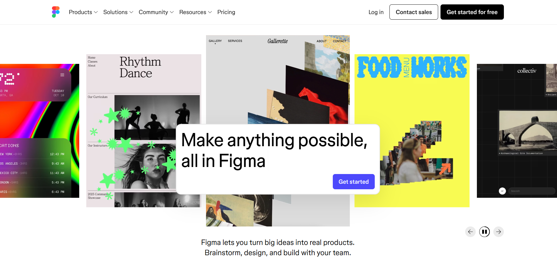
« This is Figma
Technically, there’s copy on this page. But — again — everyone knows what Figma is. At least, everyone who’s likely to want to use Figma.
So the question for other solutions is: “Why you, not them?”

Not that »
» Aspirational positioning as the leader or “The solution for X” when your audience isn’t considering you one
» Building your website to support the product vision without connecting to the present-day competitive environment and industry challenges (especially if you’re challenging the way things are done)
» Not highlighting differentiators or not listing them at all in an effort to market to your TAM
Side note:
Technically, this is at least 75% positioning. Nevertheless, this positioning needs to be translated into messaging and copy at some point.
And tips like “learn from Figma” over-focus on the copy and website layout without questioning the starting point.
You can’t have Figma’s positioning. You need to build your own.
Understanding how your prospects perceive your competitors (and whether you’re dealing with direct competitors or alternative approaches to solving the problem) is one of the first things to consider. Especially if you get prospects that are switching from competitors, meaningful differentiation matters.
Your website’s goal is to get prospects to sign up for the demo
Yes, it is! This is where things go wrong: “Just get them through the funnel” approach that doesn’t consider how your prospect prefer to shop for solutions, or what they need to convert. Another risk when over-optimizing for demos: saving all the important stuff until you get your prospects on the call. Ideally, they don’t need to talk to your sales team to understand what makes your product different and what it does better than competitors.
Instead, ask yourself:
What do my best-fit prospects need to know about my product to make a demo an obvious next step?
Is this information available on the website?
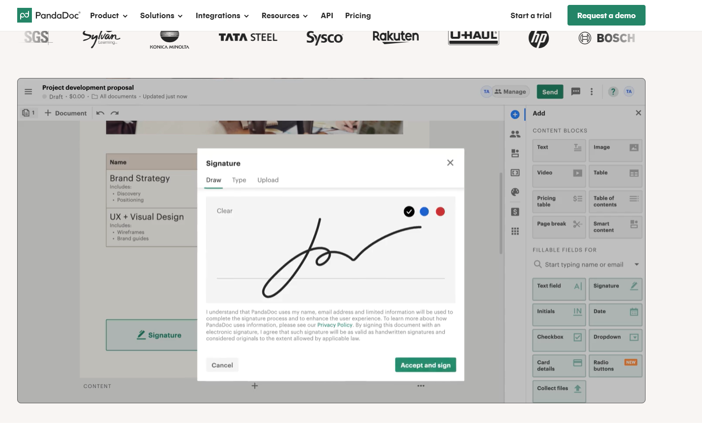
« This
PandaDoc shows the product workflow in action (another option is adding an interactive demo — as long as it’s not confusing and/or overwhelming).
This visual is placed on the homepage, right below the hero section (instead of saving it for a demo).
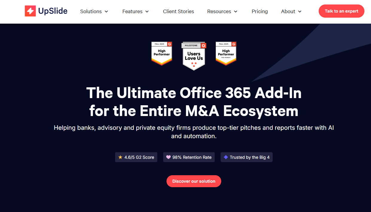
« Also This
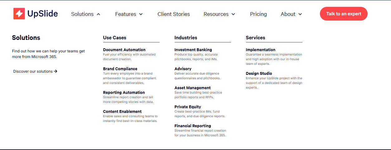
For Upslide, setting up the stage for demo means breaking down solutions by use cases and industries to make it easier to see how using their solution can be used, specifically.
(Features get a separate section as well.)
Not that »
» Overestimating prospects’ willingness to be on a demo (for some folks, it’s ‘never’ — if they can help it)
» Creating artificial barriers to increase the number of demo signups (like not showing pricing when it’s already standardized)
» Framing the goal as “we want to get more demos” instead of “we want more demos with qualified prospects that are considering our solution)
Side note:
It’s not wrong to optimize for demos. But, KPIs being what they are, it can lead to over-focusing on page-level optimization plays, like playing around with the form length, the button copy, the sections, or the page length (see above).
A helpful reframe — especially for sales-led startups — is to optimize to get on the shortlist.
Same goal, but this helps focus on the customer journey instead of the demo signup section of it.
Which means that you’ll be able to consider a bigger picture, which may include:
positioning more explicitly against competitors
connecting your product narrative to prospects’ beliefs about the industry or the way it’ll change
re-designing your website structure to match the search triggers your prospects have
re-building your pages to match prospects’ needs
Headlines are the most important piece of any page to optimize
It depends. Headlines are certainly the most tempting element of any page to optimize (especially if by “optimize” you mean “create additional variations on the same theme and see if they translate into meaningful improvements). But they’re also often convenient shiny objects that distract from more unpleasant questions, like “Are we providing enough product information?”
Instead, ask yourself:
Is there anything else (social proof / product details / different angles) that could be more relevant or help increase conversions more than tweaking the headlines?
« This
Social proof > fancy headline (Rundoo).
« And this
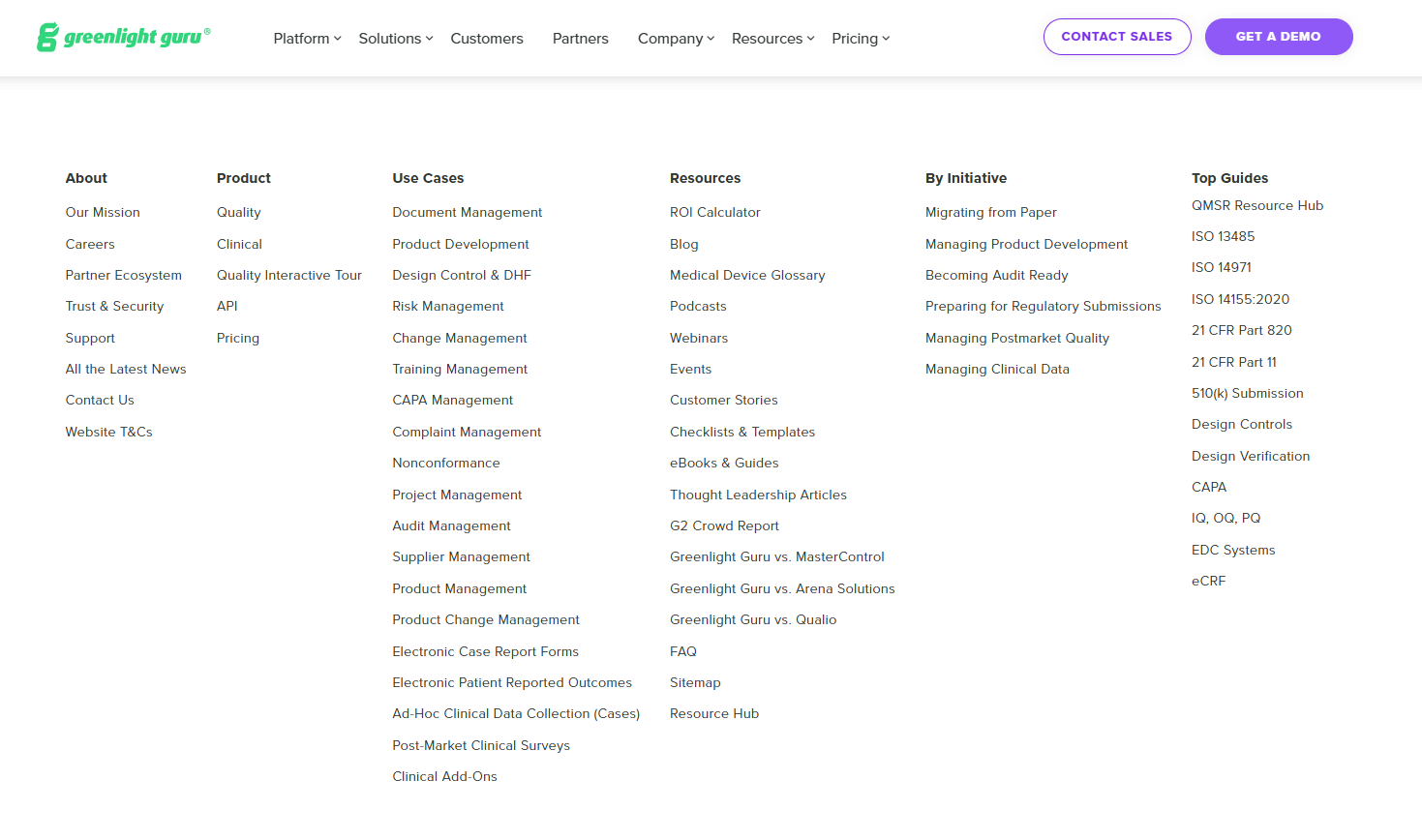
For industries with complex purchasing requirements or high-stakes product decisions (like the one Greenlight Guru is targeting), you may need to provide more information (and work harder to earn prospects’ trust) than in lower-stakes industries or for solutions that can be easily adopted.
Not that »
» Assuming that headlines are the right lever for conversion rate issues
» Going into the headline optimization mode before diagnosing the problem (lack of credibility, lack of differentiation, lack of product info to name a few)
» Defaulting to headline testing and skipping larger-scale tests (or gathering qualitative feedback on pages overall)
Side note:
I’m not arguing against optimizing your headlines. Instead, I suggest looking at other elements as well, especially if your previous website iteration was focused on keeping copy minimal and/or high-level.
In nearly all of my projects, optimization includes expanding pages to address prospects’ concerns, answer their questions, and give them reasons to get on a demo.

I design funnel-critical web pages that put B2B SaaS scaleups with complex products and long sales cycles on top of their best buyers’ shortlist.